Dark Mode Design: Best Practices for Modern UI/UX
Why Is Dark Mode So Popular?
-
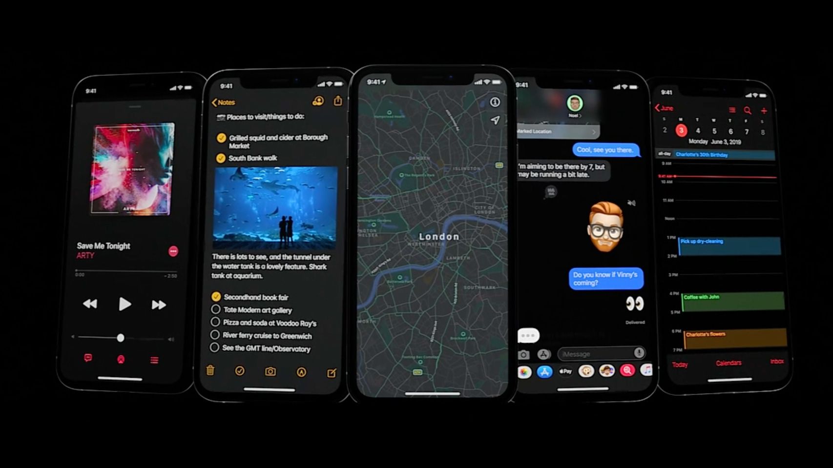
Reduces eye strain in low-light environments
-
Saves battery on OLED screens
-
Offers a modern and sleek look
-
Improves accessibility for light-sensitive users
Dark mode is now an expectation rather than a bonus. It’s time to get it right.
Dark Mode Design Best Practices
1. Avoid Pure Black and Pure White
Avoid #000000 and #FFFFFF. Use softer shades like:
-
Dark mode background:
#121212,#1E1E1E -
Light text:
#E0E0E0,#B3B3B3
Why? Pure black/white creates extreme contrast, which causes visual fatigue and readability issues.
2. Use Semantic Colors
Instead of hard-coded colors, use semantic naming in your CSS variables:
:root {
  --background-color: #ffffff;
  --text-color: #000000;
}

[data-theme="dark"] {
  --background-color: #121212;
  --text-color: #e0e0e0;
}
This makes toggling themes scalable and maintainable.
3. Maintain Visual Hierarchy
Dark mode can flatten the UI. To avoid this:
-
Use elevation and shadows carefully
-
Add soft borders and contrast between components
-
Highlight active or focused elements with accent colors
4. Test Readability Thoroughly
Test your UI in:
-
Bright daylight
-
Low-light environments
-
Devices with low brightness
Use tools like Contrast Checker to ensure accessibility compliance (WCAG AA/AAA).
5. Dark Mode Toggle
Always offer users the choice to switch:
-
Use
prefers-color-schemefor auto detection -
Add a toggle switch to override preference
const isDark = window.matchMedia('(prefers-color-scheme: dark)').matches;
Common Mistakes to Avoid
-
Forgetting to invert illustrations or icons
-
Ignoring system UI (like scrollbars)
-
Relying only on color for interaction cues (bad for colorblind users)
Tools to Help
-
Tailwind CSS – Now supports dark mode out of the box
-
Figma Plugins – “Themer” lets you switch design tokens easily
-
CSS Variables – Super helpful for real-time theme switching
Future of Dark Mode
Dark mode is evolving into dynamic themes — think automatic color adaptation based on time of day, mood, or environment. As designers and developers, staying ahead of this curve can give your product a modern, professional edge.
Final Thoughts
Dark mode isn’t just a trend — it’s an essential part of inclusive design and modern frontend development. By following these best practices, you’ll create UIs that are not just stylish, but accessible and enjoyable for everyone.

